White Knight
Specialist
- Joined
- Jun 20, 2017
- Messages
- 386
While the figures in this project are only 28-30mm and not 54-60mm, the same techniques would apply to the larger scale, so I hope this post might still be of interest.
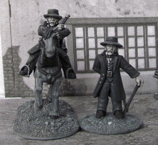
The inspiration: I had wanted to do this project for some time since I had the idea. What I wanted was to recreate the true Zorro of childhood Sathurdays, as portrayed by the unforgettable Guy Williams:
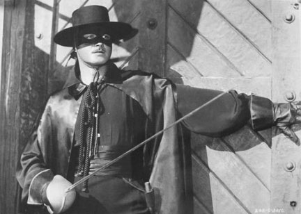
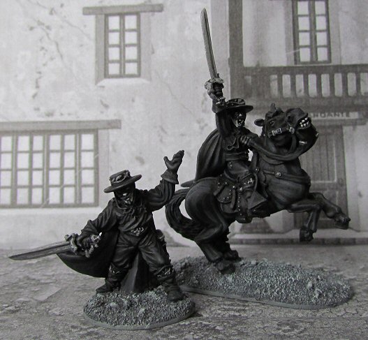
Now, the only way to do justice to my childhood hero is by representing him on the table as he was presented to me on those treasured Sathurday evenings. In glorious black and white. And so I did...
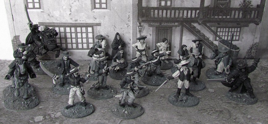
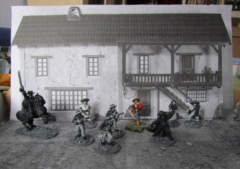
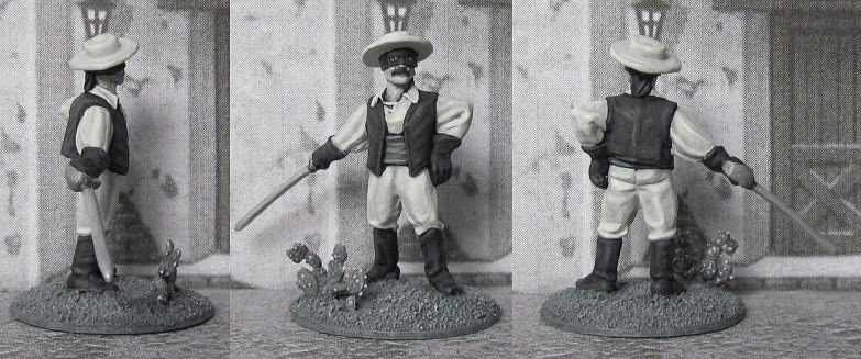
The above (and following) pictures are full colour and have not been adjusted (aside from the usual correction of sharpness etc...). I printed out a custom background and floor in black and white to serve as a backdrop, otherwise the effect would be spoiled. Here you have a shot with some colour (background and landsknecht mini in the center) (as if you couldn't see him):
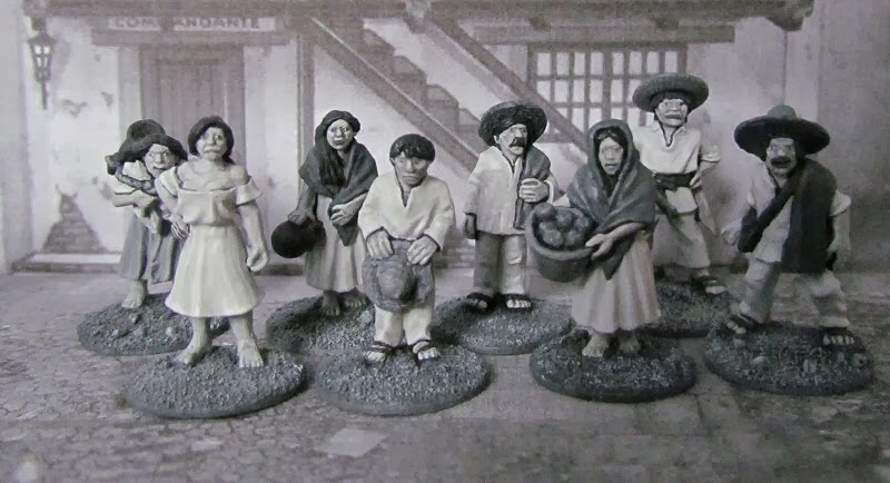
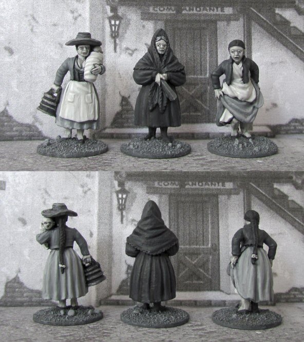
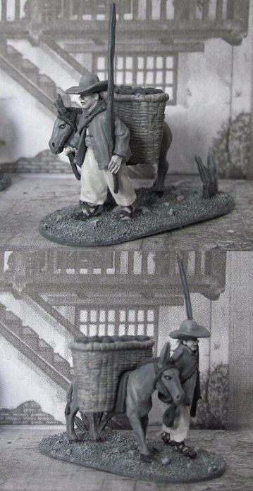
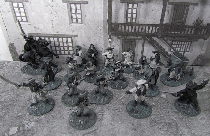
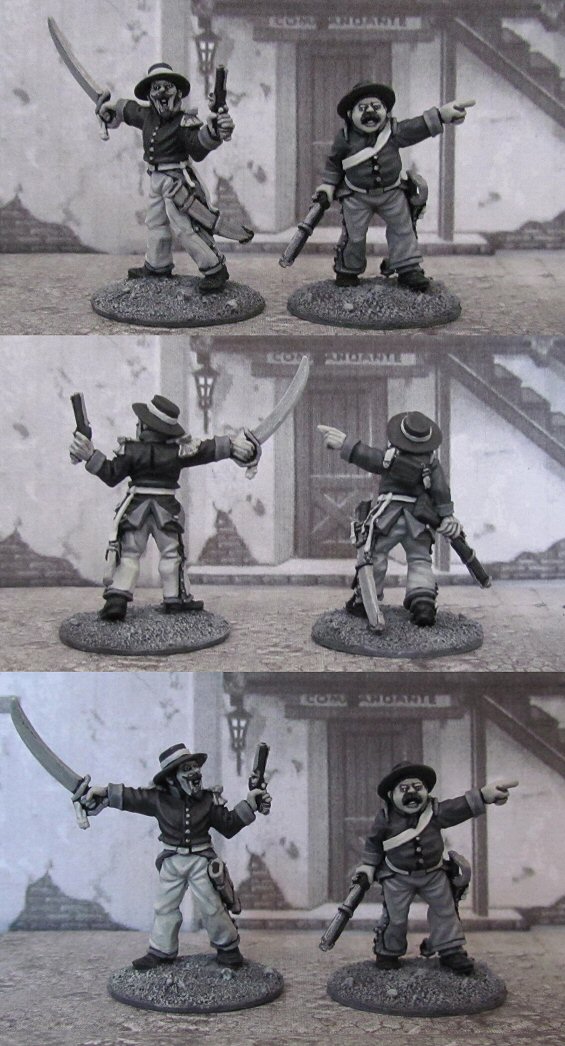
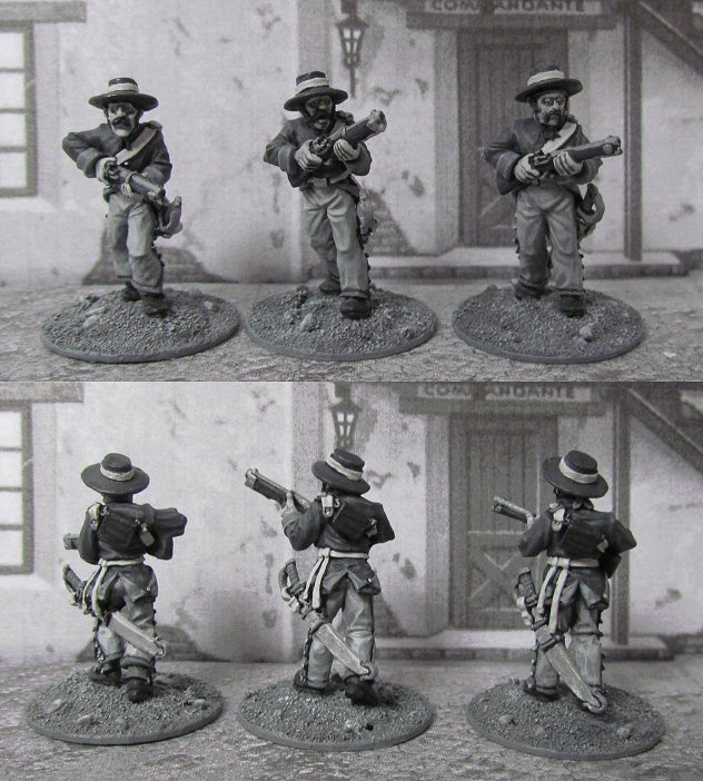
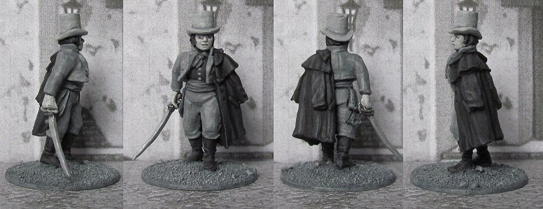
And a few more figure shots, before I go into how the effect is done:
It's easier than it looks to get the effect if you apply a few simple rules. The most important is to pick the right colours. You have to be aware that there are two types of greys: warm greys and cool greys, and that you can only use all cool greys or all warm greys if you don't want to spoil the effect. It may not always be evident which is which and you can only know for sure by painting them on a piece of paper and putting them side by side. And even then, there can be so many gradations in warmth that not all cool greys will work perfectly together.
Mainly, I have found I only use 4 different shades of the dozen or so greys I have and 90% of all the work is done using 2 out of those (a light one and a dark one, mixed together to create lighter and darker shades). So you really only need to find 2 that work well together. The fewer different paints used, the better the effect IMO.
The dark one I use is vallejo german grey and the light one is a coat d'arms one called light grey. I also use one of the Foundry arctic grey shades (33B) when I do the skin (washed with a thinned glaze of the german grey. You don't really need it as a similar tone can be obtained when you mix the other two. The advantage offered by the arctic grey is just that your skintone remains consistent throughout, which can be hard when mixing shades (I have some occasional trouble with matching my bases for instance as it's not an "out of the pot" shade). The last colour is a really light grey, the Vallejo "white grey".
I use black for blacklining and the basecoat of truly black items like zorro's clothes, anything else is grey. Even then, only the basecoat is black and then highlighted with the german grey, leaving black only in the deeper folds. I don't use any white anywhere. The light clothes as seen on the peons and the eyes use the white grey as the lightest colour.
Finally, do not expect this to be faster than colour painting, for the effect to fool the eye, you can't cut corners. You have to paint them as if you were painting in colour, but substitute different grey shades for different colours. If you're not exactly sure what shade to use where, look at greyscale pictures of the subject you are painting (with zorro it is easy to look for pictures of the TV show) and if none are available, find some nicely painted pictures of the same figures and convert them to greyscale, so you can see what to aim for.
There is more info on the sources of the figures on my blog should anyone be interested: http://zorro28mm.blogspot.be/
The inspiration: I had wanted to do this project for some time since I had the idea. What I wanted was to recreate the true Zorro of childhood Sathurdays, as portrayed by the unforgettable Guy Williams:
Now, the only way to do justice to my childhood hero is by representing him on the table as he was presented to me on those treasured Sathurday evenings. In glorious black and white. And so I did...
The above (and following) pictures are full colour and have not been adjusted (aside from the usual correction of sharpness etc...). I printed out a custom background and floor in black and white to serve as a backdrop, otherwise the effect would be spoiled. Here you have a shot with some colour (background and landsknecht mini in the center) (as if you couldn't see him):
And a few more figure shots, before I go into how the effect is done:
It's easier than it looks to get the effect if you apply a few simple rules. The most important is to pick the right colours. You have to be aware that there are two types of greys: warm greys and cool greys, and that you can only use all cool greys or all warm greys if you don't want to spoil the effect. It may not always be evident which is which and you can only know for sure by painting them on a piece of paper and putting them side by side. And even then, there can be so many gradations in warmth that not all cool greys will work perfectly together.
Mainly, I have found I only use 4 different shades of the dozen or so greys I have and 90% of all the work is done using 2 out of those (a light one and a dark one, mixed together to create lighter and darker shades). So you really only need to find 2 that work well together. The fewer different paints used, the better the effect IMO.
The dark one I use is vallejo german grey and the light one is a coat d'arms one called light grey. I also use one of the Foundry arctic grey shades (33B) when I do the skin (washed with a thinned glaze of the german grey. You don't really need it as a similar tone can be obtained when you mix the other two. The advantage offered by the arctic grey is just that your skintone remains consistent throughout, which can be hard when mixing shades (I have some occasional trouble with matching my bases for instance as it's not an "out of the pot" shade). The last colour is a really light grey, the Vallejo "white grey".
I use black for blacklining and the basecoat of truly black items like zorro's clothes, anything else is grey. Even then, only the basecoat is black and then highlighted with the german grey, leaving black only in the deeper folds. I don't use any white anywhere. The light clothes as seen on the peons and the eyes use the white grey as the lightest colour.
Finally, do not expect this to be faster than colour painting, for the effect to fool the eye, you can't cut corners. You have to paint them as if you were painting in colour, but substitute different grey shades for different colours. If you're not exactly sure what shade to use where, look at greyscale pictures of the subject you are painting (with zorro it is easy to look for pictures of the TV show) and if none are available, find some nicely painted pictures of the same figures and convert them to greyscale, so you can see what to aim for.
There is more info on the sources of the figures on my blog should anyone be interested: http://zorro28mm.blogspot.be/