Stalingrad 1942-43 (3 Viewers)

I took on to enlarging my experiment and added to my heavy FL Divisional artillery piece two other guns by Hinchliffe and a myrid of garisson complements from JJ, K&C and FL and they all worked out very nicely....I am happy with the results. Here are pics I wish to share of the outcome....

Guys.....I made a mistake...I added T&G and not JJ!! Ops on the miss....
 
Andanna,

You've got the lighting nailed. Excellent pictures :salute::


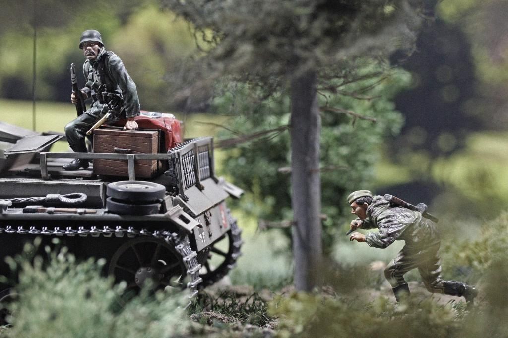
great photo's but, my favourite is the Russian taking on or, about to take on a German soldat and Stug now, that is Hardcore!!
Mitch
 
Thank you for the Likes and comments. It was time to get back into taking photos staging some of my Collectibles.

Prior to this effort, I re-read this whole thread and am still and renewed amazed at the improvements Frank went through since the inception of this thread. Unfortunately, I cannot say the same about me. So any constructive criticism is very welcome.

Frank, you are very generous with your praise. Thank you. It is very encouraging. Having said that, I was very unhappy with the lighting of the first two photos. The reason is that I had moved out of the photo tent and operated under direct light. This is not very becoming and produced a lot of glare on the figures. I then held a fabric sheet over the scene and I think I did much better on the third photo and on the one of the Napoleonic Horse Artillery. But deflectors for the lights are on their way.

I agree with you, Mitch. For a photo of a toy soldier, the photo is hardcore. I had shot one like that before. It feels like a lifetime ago.

IMG_5168copy.jpg
 
Relaxed crew with their Sd.Kfz.222, August 1942.


Frank

Frank, these are again great photos. Thank you.

Because of your skills and equipment, in particular the lens, I think the limits are established by the quality of the figures. I therefore have a preference for your pictures nos. 1 and 2.

This also creates an ethical dilemma. Should the photographer use photoshop to "improve" the figures for photos? I did remove a seam of a Russian soldier's jacket in one of my photos - more because I could by using photoshop than by artistic need. If people buy these soldiers based on these photos, that photo would hence be misleading - and without a good reason as the figure is outstanding and did not really need my intervention.

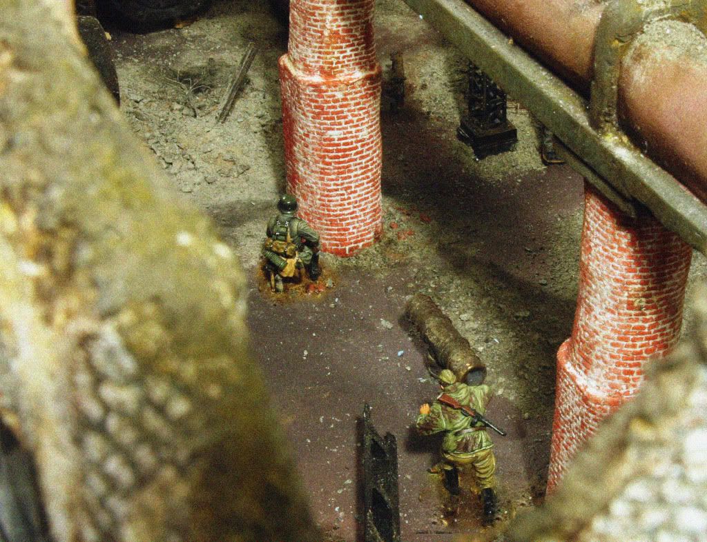
But for example in Frank's photo no. 3: should Frank using photoshop blend the face colors better than what the painter did? Otherwise, we will need to step up the quality for figures that are being used for close-ups.

I did not want to hijack the thread, but Frank did raise the question of how to improve photos, even his, and so I think the question is fair. But then maybe that discussion is for another day.
 
Thanks

My personal rule is I will not Photoshop the figure with the exception of the figure base. This means leaving undesirable glare and other potential defects as is. My feeling is it would be a slippery slope from touch up to alteration.

I'm much freer using Photoshop to finish the overall scene (i.e. extending scenic elements, touching up scenic flaws etc.)

Frank
 
Thank you for the Likes and comments. It was time to get back into taking photos staging some of my Collectibles.

Prior to this effort, I re-read this whole thread and am still and renewed amazed at the improvements Frank went through since the inception of this thread. Unfortunately, I cannot say the same about me. So any constructive criticism is very welcome.

Frank, you are very generous with your praise. Thank you. It is very encouraging. Having said that, I was very unhappy with the lighting of the first two photos. The reason is that I had moved out of the photo tent and operated under direct light. This is not very becoming and produced a lot of glare on the figures. I then held a fabric sheet over the scene and I think I did much better on the third photo and on the one of the Napoleonic Horse Artillery. But deflectors for the lights are on their way.

I agree with you, Mitch. For a photo of a toy soldier, the photo is hardcore. I had shot one like that before. It feels like a lifetime ago.

It's interesting to hear you aren't happy with the pictures. I thought the high contrast was an effect you were after. It is quite attractive actually. I often marvel at many of the pictures collectors post that aren't necessarily technically perfect but have a more authentic look to them. Sometimes my drive for sharp focus, correct color, balanced framing etc. can end up looking "over produced" if you know what I mean.

Glare can definitely be a problem with direct lights but my solution is to work the angles. Position the light and camera relative to each in such a way as to avoid flat surfaces reflecting light directly into the lens. Diffusing the light will work as well but the down side is your shadows will lose definition. If you are trying to achieve bright sunshine you need deep sharp shadows which require a point source light. Another way to diffuse your lights is to point them at the ceiling. I do this when indirect light is required (i.e. dawn, overcast etc.)

Frank
 
Frank and Andanna. Both of your dio's are great! Keep em coming! Brad
 
I made the same experience with direct vs indirect light. So in photo#1 I am happy with how the shadow covers the German soldiers face, but am unhappy with the two lights reflecting on his helmet. WWII was just not fought on a planet with two suns. In short, I need to gather more experience in creating hard contrast, but still being able to hide the light sources. Moving the lights is great advice. It sounds simple, but I did not do it.
 
Frank, these are again great photos. Thank you.

Because of your skills and equipment, in particular the lens, I think the limits are established by the quality of the figures. I therefore have a preference for your pictures nos. 1 and 2.

This also creates an ethical dilemma. Should the photographer use photoshop to "improve" the figures for photos? I did remove a seam of a Russian soldier's jacket in one of my photos - more because I could by using photoshop than by artistic need. If people buy these soldiers based on these photos, that photo would hence be misleading - and without a good reason as the figure is outstanding and did not really need my intervention.

But for example in Frank's photo no. 3: should Frank using photoshop blend the face colors better than what the painter did? Otherwise, we will need to step up the quality for figures that are being used for close-ups.

I did not want to hijack the thread, but Frank did raise the question of how to improve photos, even his, and so I think the question is fair. But then maybe that discussion is for another day.

Truly great photo

Carlos
 
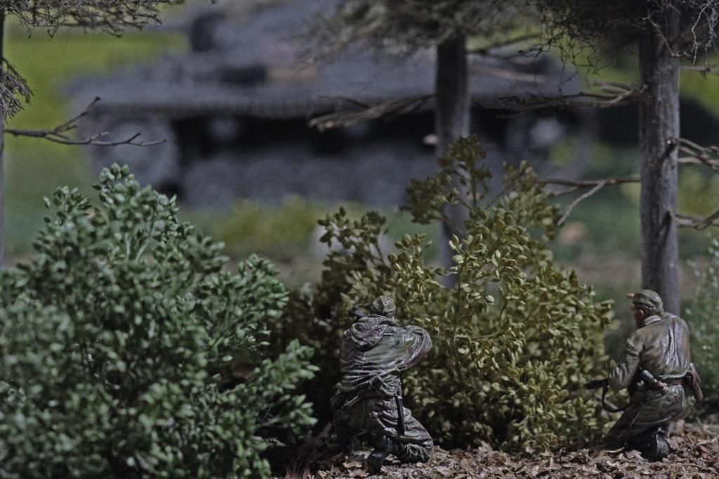
It was standard practice for crews of vehicles on the march to immediately attempt to conceal themselves when not on the move.

An armored car from 16.Panzer-Division uses a tree to help avoid aerial detection.


Frank
 
Without a doubt Frank, your pic's are the closest to the real thing! Brilliant!{bravo}}

Tom
 
Love the crystal clear surrounds. Just does so much to high light the TS's. Robin.
 
Thanks guys. I hope we see some more releases in this range in the not too distant future.
 
Frank,
I have been looking at your pictures in this forum topic several times today...you really make it look like art! Makes me want to place an order right away for some WWII figures. Keep up the wonderful work! :)
 
August 30, 1942

Soviet forces counterattack XXXXVIII. Panzerkorps, 4. Panzerarmee (Hoth) south of Stalingrad in the vicinity of the Volga-Don canal.


Frank
 

Users who are viewing this thread

Back
Top